Creating art collections

Backyard, watercolor art collections

Choosing artworks for collections

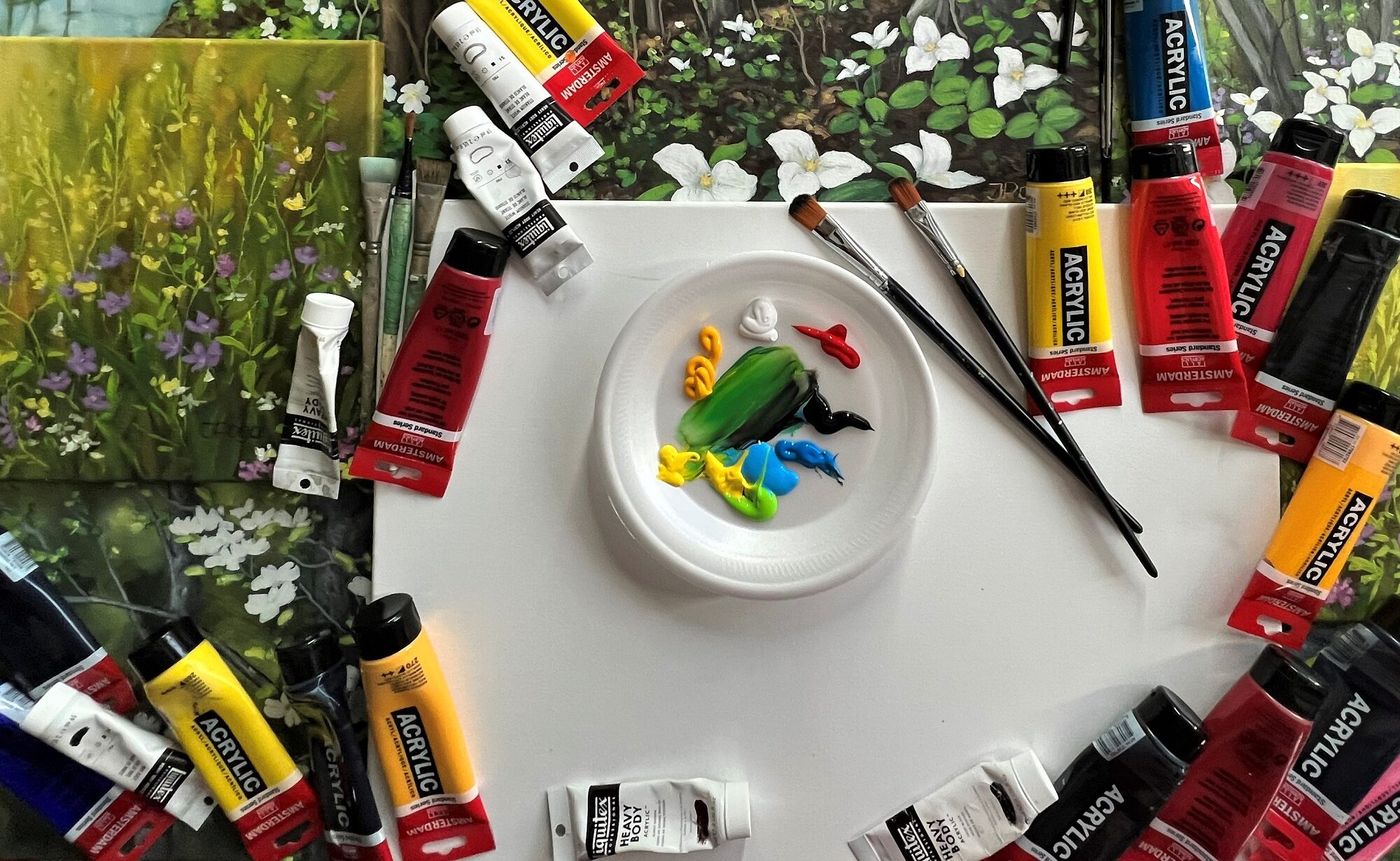
If you have been painting for a decade or longer as I am, it’s possible to see how all artworks fit into art collections. What are the criteria for creating art collections? There are many, and any large body of artworks can be sorted out by medium, style, certain color or particular subject. The best example is my Fine Art America art collections. I have put together art by medium, by subject, like floral art, still life, landscape and also by color. There will be black and white art collection available soon, as well. See link below or on Menu.

Painting from imagination

The spring as always is arriving slowly in Ontario. We see long periods of grey and earthy colors around us. The more grasses and trees wake up, the more patches of bright green are visible. Therefore, my grey and abstract watercolors were a good match for my surroundings. As I have mentioned many times, I prefer not to use any photos for my art. The spontaneous watercolors are simply watercolor washes at first, and I sort them out as I go and add definition. It is extremely easy to create art collections of abstracted art.

Getting composition right

Classic painting consists of background, middle ground and foreground. Plus, we need something to capture viewer’s attention with. It’s called a focal point in art. Everything including lines and colors of different values is organized in accordance with our composition. I believe that composition is difficult to implement when the artist doesn’t feel visual balance and natural flow of their image. I personally do not use any view finders or similar tools; I just adjust my composition as I feel it. Some of my art collections include highlights of compositional elements.

Simplicity versus complexity

Fragmented art can look better sometimes than very accomplished and compositionally perfect painting. Art collections can include simplicity or complexity of a particular subject, use of color and compositional elements. The blue period art collection displays exactly that – simplicity and strategically placed watercolor washes.

Art reflecting the season

Most of my art also goes by season, therefore, I have seasonal art collections, as well. Spring and summer landscapes, fall colors and snow paintings, they are all interesting on their own and placed in art collection. Floral art is a very big part of everything I have ever painted, I think it deserves a separate post. I know people who have painted a few artworks, some five or six paintings, and they try to immediately sell them and even teach painting. Well, it’s better to allow our skills to mature so that we are represented by what we do well, not by our first attempts at painting.

Buy original painting?

Original paintings have never been more affordable than they are now. I looked at my price charts from 2013, and my paintings sold for double the price I have listed now. That’s a horrible thing because everything has become at least 5 times more expensive. That includes watercolor paper, paints and I won’t even mention framing. There are inexpensive options, but I simply have too many paintings to frame each one. Therefore, I’m offering some framed art and some – unframed.

Available watercolor painting originals are posted on this page:

Original watercolor paintings for sale

All available art prints can be purchased here:

Art collections by Inese Poga

Want to learn watercolor painting? Check out this page:

Group art classes

Techniques for spontaneous watercolor painting

Abstract watercolor painting, private art classes

The versatile watercolor

Watercolor is a medium we can use in hundreds of different ways. What we create and how it looks depends largely on technique we apply. While many of my watercolors look carefully worked out, I often start painting with just randomly washing some paint onto watercolor paper. I posted my spring palette colors in the previous article. For spring paintings, I am using a limited palette:

Payne’s grey

French ultramarine

Brilliant yellow

Burnt sienna

Burnt umber

Gold ochre

Leaf green

It’s possible, however, to create numerous color tones using these paints. They work well together and with decent application of water, there’s no mud. I will work on floral spontaneous watercolors next, and I am adding magenta and carmine for these.

Allowing paint and water to work

While the paint application is extremely loose, I still have some idea. Washes look great when painting treescapes and paintings with abstract water. This is a technique which perfectionists might not like. We simply allow colors to mix and flow as they please. It’s a myth that watercolor painting cannot be adjusted or changed. One just needs to know how to do that.

Lifting paint

I think many watercolor artists use too less of paint lifting technique. For paint lifting, large brush with pointy tip is very useful. My main brush is Luke number 14, round. Along with simple lifting, I implement one more step: lifting with very liquid other color. It’s a fantastic, but unpredictable process. It’s also fun, and I love this technique because it allows me adding definition to subject. Lifting paint is an essential technique for spontaneous watercolor my-style.

Non-cotton paper has its uses

Lifting automatically takes care of the negative space. When to lift and where to add paint depends on our personal preference and feel. For this technique, cotton paper is not the best option. Non-cotton watercolor paper makes lifting paint an easy step. In fact, it’s way easier to lift paint from some thick non-cotton papers than to add an extra layer. I am using for these paintings Strathmore 400 series paper. It requires flattening afterwards. All non-cotton watercolor papers must be weight-pressed after application of water and paint since they become uneven.

Multi-step process

While people ask when I will have online art classes, I must say, I probably won’t. Things I am writing about most often cannot be shown online. One must see the actual process in order to understand how we create loose, spontaneous watercolor painting and add the touch of reality to it. The process involves drying paper and restarting wet-on-wet, then adding dry paint, then lifting more and so on. It takes about 6-8 hours to paint one artwork. I have spent about 3 days in average on each painting.

Testing paints

Spontaneous watercolor works great for people who just want to explore what their paper and paints can do. Check compatibility of colors before you start painting. Water takes care of lot of things with loose watercolor painting, but there are colors which will destroy the flow and cause unpleasant muddy shades. To avoid that, learn what your paints do. My paints are rich in pigments, all artist grade. I never use white or black colors, as well as, I don’t even have masking fluid. These paintings consist only of watercolor paint on paper.

Give it a try

Want to try this approach? No better time than now. This means absolute freedom, you don’t need any photos to follow, but having an idea is helpful. I love using the earth colors togethers with blue and green. Burnt sienna adds a bit of red tint. Simplicity is beautiful; however, I’ve never been a minimalist in any regard. That goes for any of my paintings. Well, we can stop working whenever it feels right.

Group art classes

Private art lessons

Painting without restrictions, spring landscape

Painting in progress, Highland creek landscape

Being in spring landscape

What to do during the dull and dark February days? Probably, just keep painting. Acrylic painting is a bit more difficult with heating on, but it is also very rewarding. I pick myself up and place in the middle of spring. We used to go for walks along the Highland creek which offers attractive views and many varieties of trees, wild plants, chance to watch animals, jump over rocks and rushing water. Creek is wide in the middle part and water stays quite still in some spots. This is like mental transition in time and to another place. Thus, spring landscape is born.

Central part of Highland creek flood water painting

Imaginated reality

As you know, art has no restrictions. That includes the painting subject, colors we use, parts we paint and parts we don’t. I’m usually not that worried about how realistic something looks when painted. There must be some joy and fun put into every brushstroke. I usually paint as I see something in my head. When I look at empty canvas, I can easily visualize what is going to be there, in this spring landscape for instance. Similar to when we have a piece of fabric and we can imagine how the ready outfit will look. Imagination has no borders, too.

Top part of Highland creek flood water painting

Spring landscape as painting subject

This Highland creek flood water painting was done for the private art classes. I thought spring landscape was very fitting since we can paint much less of it or add much more to any part. We can leave the distant part completely abstract. Well, my student was impatient and here and there jumped over the gradual steps which processing an acrylic painting requires. My demo steps got jumpy, too, but, nevertheless, this painting was brought to completion just a few days ago. What you are seeing, however, is not the painting, but images of it. I straggled getting all parts of it onto pictures.

See painting steps above

Getting correct colors in acrylic painting

What’s most important for me personally, is whether the mood in an artwork can move us, inspire us, make us want to be there, in that place which doesn’t actually exist in the real world. I am trying to also teach my students patience and correct use of acrylic paints. While any wet acrylic painting might look perfectly right, it will definitely dry darker. The weaker the paint we use, the darker our painting might become. I regret noticing how Liquitex heavy body professional grade paints have lost some of their quality over years. That refers to Titanium white and yellow shades.

Close-up of front part

The usual acrylic painting principles

Regardless of our artistic intention, we always work from dark to light in acrylic, always from underneath upwards, always from back to front. With heating on, acrylic paint can dry immediately, therefore, we glaze separate parts and work in small segments. The lore layers acrylic painting has, the better it will look. That especially refers to the moment when somebody sees the actual painting in person. I sometimes go over even the final layers if the paint has become too dull in some spots.

Highland creek flood water, acrylic painting 24 x 18″ or 61 x 46 cm

Place yourself in this spring landscape

I hope you love this spring landscape and its mood. I believe you’d hear birds singing and water rushing over wet rocks and grasses if you are able to forget the surroundings for a moment and be immersed in this painting. It’s in great size, not too huge, not too tiny, 24 x 18″ or 61 x 46 cm. The steep vertical format adds a good quality to this spring landscape and pushes compositionally important elements close to the viewer.

Just like always, thanks if you read my post! I intend to catch up with likes and comments.

Private art lessons

Group art classes

Art collections by Inese Poga

Watercolor, beating the blues with art

Sunny spring creek watercolor

Bright and sunny watercolor art

On TV, they were talking about winter blues. How this dull and wet January weather makes people feel down and upset. Our mind tells us that spring is far away, and to make everything worse, the sky cries with us. Bright and sunny watercolor art is my personal cure, my response to mood swings and upset mind. I paint the places where I want to be and flowers which will start in April or May.

Uplifting creativity

Not all people are artists, but many have paint sets at their disposal. Brushing bright, sunny colors on paper or canvas makes a big difference. It’s an immersive activity which allows to create our own imagined reality, very distinctive from the current settings. This year has been tough so far, so taking our mind off the painful and upsetting matters is vitally important.

New large-size watercolor art

All of these watercolor paintings are the same size – 24 x 18 inches or 61 x 46 cm. Well, to express ourselves, we need space. Tiny paper just won’t do that for you. It’s not cotton paper I used for these paintings. All of our art stores are closed now, and that leaves online shopping which I dislike. Paper is a very important part of watercolor painting, and each paper acts differently. This paper allows lifting paint easily, but it’s very problematic when adding paint layers.

Spring pansies, 24 x 18″ watercolor painting

Watercolor painting with pansies was started in the winter of 2021. So, it sat in a folder until I decided to add a few layers of paint and finish it up. Photos show way more white space, and I just cannot do anything about it. That’s how phone camera acts when there are white or light areas. Just imagine more purple and pink color on blooms because that’s how they look. Anyway, pansy blooms make a great subject in all regards. Use any color, any number and view of blooms.

Early spring flood, 24 x 18″ watercolor painting

The Early spring flood is based on views around our place. It’s a painting where you just throw on colors – Payne’s grey, Cobalt blue, Burnt sienna, Green gold, some yellow and Burnt umber. This all mixes itself on paper and then we swipe clean the areas which we would prefer to be white. We outline the trees, add leaves, wash on more color and sprinkle with a little of leaf green.

Watercolor wash and color

It is much easier to create watercolor paint washes on cotton paper, but if you don’t have it, any firm and thick watercolor paper will do. It needs to be thick and heavy since thin paper just rolls off and buckles. It was tricky to get any pictures of this painting since I don’t have good photographing light, and it’s been cloudy and very dark almost every single day. I love the dreamy quality of this painting, although I couldn’t get it on pictures. Colors are balanced – I used warm and cool shades to create the early spring mood.

Sunny spring creek, 24 x 18″ watercolor painting

I started the Spring creek painting (one more!) for a private art class last spring. It was half-done, just as many of art classes paintings are. It took me a while to get back to it, but I am very satisfied with the play of colors and placement of details. This painting is done with Cobalt and Brilliant blue, Burnt umber, burnt sienna, Lemon and Cadmium yellow, as well as Raw sienna and Sap green and little bit of Payne’s grey. This painting involves quite many layers.

Bright and happy art reality

I’d say these paintings show a very bright and happy place and that’s where I reside when I don’t have to deal with daily chores and other issues. It’s a perfect escape from daily routines, a perfect way to beat the winter blues. I think it’s time to write a new guidance for beginning artists. Trust me, tutorials cannot teach much about painting as such since it’s always something a particular person prefers and does. When we learn paint, we decide on everything – style, colors and subject, but tutorial requires to simply follow and copy.

I hope you’re dealing well with everything which comes your way. Spring will arrive eventually. Thanks for reading!

Art prints: Art collections by Inese Poga

Painting classes: Group art classes

Art studio highlights of 2022

Inese's Art Studio

My art studio experienced numerous changes in 2022. First of all: the move which started with packing already in February. By the middle of March, I started adapting and adjusting the available space for art studio needs. By any means, it wasn’t easy. It’s needless to say that neither painting, nor art classes couldn’t start until May, I believe. If you have ever packed up and then unpacked a large art studio with numerous artworks and countless tools, brushes, paint tubes and paint sets, papers of all kinds and so forth, you probably know that it is a very complex undertaking.

I paint spring during winter months, and 2022 was no exception. It is very inspiring and self-explanatory for me to go with the change of seasons, except, I am trying to be always ahead. The adjusted and new spring paintings were published in February. Trillium blooms are fantastic subject, and white color on its own makes painting alive.

The first painting I painted in the new studio was a fairly large early spring landscape (above) with lots of trees. I do love trees, I watch them, observe and to me they feel like live beings. I frequently use textures on canvas for more impact and strong statement. The horizontal Apple tree landscape was also finished soon.

I moved to garden and abstracted landscape paintings afterwards. That was done because of art classes and since every class needs a demo, I bring to finished stage some of them. That is how Colors of garden and Colors of summer came to life.

Summer flew by swiftly, working in the garden and giving numerous private classes in drawing. Teaching drawing isn’t easy also since regardless of what I explain and how much I show, it is the student who moves their hand with pencil. I haven’t taken photos of all drawings and sketches, but there were numerous, and we do large drawings in order to reveal all important aspects.

I took new photos of previous paintings, and some have never been published before. I find that only featured image on WordPress is sharp and correct while the images contained within the post look somewhat off. Anyway, numerous pictures were taken and lots of hours spent on making them look like the real painting.

Then came preparations for my 5-week long solo art show at Ajax Community Centre. Any show means work and feeling not good sort of interfered with that. Anyway, some art required touch-up and more layers of protective medium and some art was painted specifically for the fall show. Two times this year, my step-by-step demonstrations ran in the magazine which is devoted to art in the Greater Toronto Area. My art studio is doing fine, but not enough.

This year was complicated in many regards. It’s impossible to say whether good or bad. I still need to do better next year. While I have created many new paintings in acrylic watercolor, ink and graphite, I will try to incorporate myself more into the local community, gain more attention and be more present on the art scene. My art studio is set up now, and everything has found its place. Well, all it takes is more work, more motivation and simply – more luck and opportunity.

Wishing everybody a successful and pleasant New Year! I hope it won’t disappoint.