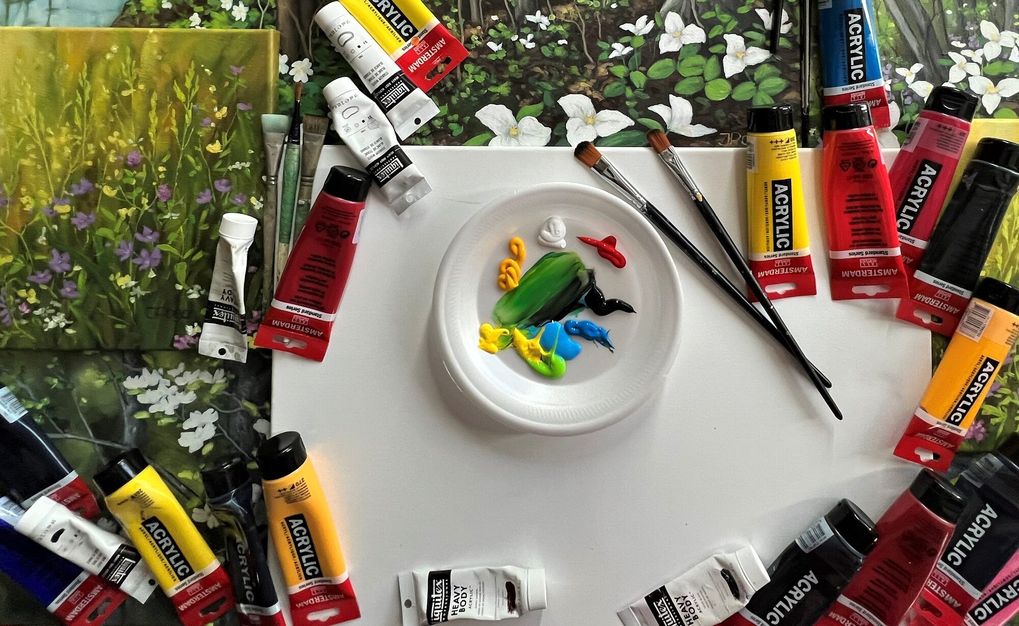
When I started using acrylic paint some 20 years ago, it felt like a medium I can really engage in. Watercolor is beautiful and has its own applications, but acrylic paint allows creating volume and pretty much touchable effect. I love that it doesn’t have smell and I can use acrylic paint in many layers to achieve the magic in my paintings.
The most recent painting has been long in making since it took me almost a year to recover. It can be difficult to return to the mindset and intended painting process I had envisioned that long ago. Nevertheless, the first steps were inviting, and I decided to add more layers and complete this painting. Just like always I have quite many unfinished acrylic paintings. All will be done sooner or later.
When the fall season starts, I do enjoy the bright colors I can apply to my watercolor and acrylic paintings. I had some grey periods and then gold and subtle color period, but eventually I returned to strong, bright colors. To have more magic with acrylic painting, more contrast and volume. As I have mentioned before, I use paint in layers.
Every picture shows more added layers. Like always, the actual painting is better than pictures thereof. Walking into fall season is 20 x 24” acrylic painting on canvas. It is available now, after 2 days I finished it. There are certainly people who appreciate bright and lively colors in a great landscape which also has a fantastic perspective.
Many years ago, I had done some rough sketch with watercolor pencils on a 24 x 18” Arches paper. Probably in 2009 or 2010. We used to travel a lot back then. The sketch was of a creek with trees in fall colors. While the photo of step 1 is very white and light in value, the actual sketch was not. You might know that it’s not possible to erase watercolor pencil lines. I didn’t like everything in that sketch, but I love challenge. I decided let’s try to make out something of this creek in fall colors.
Techniques I used
I don’t use masking fluid, but rather prefer painting large and even huge shapes so that it’s possible to paint around whatever I need to. Good, firm and thick cold press watercolor paper allows for lifting and adjustment, as well as layering many times over the basic color. Rocks are great for application of salt. When applying salt, one has to be mindful of timing, there’s fairly narrow window when this technique works. If the rocks are really large and the entire painting is large, we can do numerous extra things.
Changing and correcting watercolor painting
The photos of painting steps of this creek in fall colors might not have the exact colors and contrast, however they give an idea of how one can change and improve watercolor painting even when initial shapes are not correct. I’m reading in Facebook groups how people describe watercolor as difficult and something one cannot correct. That’s wrong! If you paint large and on good paper, you can change and correct everything. The best colors to lift are all blue shades, even Payne’s grey can be lifted to almost white paper.
Use live art classes
I teach all painting techniques in my live art classes. I can see that online class doesn’t give one proper understanding of what and how to use, what timing should be applied, how to use paper towel, lifting and layering and what colors work and what don’t. It was a difficult picture to take photos of because of the distinct cool and very warm colors. Their use is absolutely intentional. That’s also important aspect – color temperature.
Imperfections are fine
Just like always, my photos could better, but I am going ahead and publishing the creek in fall colors. The reason I want to paint somewhat realistic watercolors, even imaginative ones is that abstracts are not challenging enough. I’m not worried also that absolutely everything isn’t perfect. When it comes to painting, I’m all for process and for challenge. If it’s easy, there are no thrills for me.
For beginners in watercolor painting
If you are a beginner and want to paint with watercolor, go big. You are not going to ever leant painting with tiny brushes on tiny paper. There’s simply no space for any effects. Also, using tutorials and watching somebody else paint isn’t going to help much. Brush and paints are important, but what matters most, is the hand that moves the brush. I would like to remind how important is value sketch in large size. Contrast and values are what make painting appear three-dimensional. To check your values, turn the painting in black and white. If it still shows the subject correctly, values are right, too.
Our personal preferences change all the time when it comes to colors which surround us. That goes even beyond mood or life situation. I usually prefer the following: the worse I feel, the more brightness, sunny colors and uplifting experiences I require. We all know that sometimes there’s not enough energy for anything, but a good outfit, sun and warmth outdoors and cheerful settings indoors can be very soothing. I’m always implementing this approach also in my art. To lift my own mood, to help others.
Not only colors and style
There’s one group of people who will only notice colors, but not the compositional excellence, quality of paint application and brushstroke. Well, when viewing something online, colors can be deceiving. Any image editing aps and cameras aim for unnatural look so that more attention is drawn to contrast, brightness and saturation of any image. The most difficult thing is to make something look as it is. I am really trying, but not often successfully.
Filling all walls with art
Different cultures prefer different things on their walls. In Latvia which is my native country, people usually do not display photos, unless it’s something extra artistic and rather art than photography. At least that was when I resided there. We keep family photos in albums, on our devices and so forth. Therefore, more paintings are displayed. My home is my studio also, and paintings are everywhere, on walls, leaning against the walls, on shelves and so forth. One might think that it feels overwhelming, but, in fact, it absolutely doesn’t.
Enjoy the autumn in art
I am allowing art of different seasons and subjects fill any room. It feels great thanks to the good energy flow from my original art. Every painting has its history, process of creation and associated emotions attached to it. I know from experience that my visitors can view a painting for quite a while. This post has attached a few original watercolors which I started painting for art classes as a demo. In this case, these were private art classes. They all have brightness, uplifting colors and style.
Specific features of attached watercolor paintings
All attached images are of large watercolor paintings – 24 x 18” or 61 x 46 cm. I use Strathmore 400 series watercolor paper in art classes. It is heavy, firm, cold press paper with some texture and allows for easy paint lifting. That’s important for me since I do not use any masking fluid. I don’t use masking fluid even on cotton paper, that’s just to see how well I can master paint application. I paint large which I advise anybody who wants to ever properly use not only watercolor, but any paint.
My own preferences and students’ choices
Would I have chosen the same subjects, colors and style if I had done these paintings on my own? Probably not. For art classes, I have to take into account the ease of paint application and mixing properties of paints. Also, I have to go with student’s choice, especially if it is a private class. Still, I think these paintings are worth to display and potentially sell because they are worked out quite nicely. Just one more thing: many people believe that one cannot correct watercolor painting. That’s wrong. You can, you just need to know how to do that.
Many of my watercolor paintings are created as demonstrations, spontaneously, without much planning. It’s difficult to know what each group or student wants, so I have to switch swiftly from one subject to another, from one color palette to the next. Fall season watercolor paintings shine through the light and numerous shades of red, burnt sienna, golden ocher, warm, deep or cool yellow shades, orange, grey, purple an so forth. Fall season watercolor paintings allow using many approaches and techniques.
I am sticking this time to fall season watercolor, but we have done also many new acrylic artworks. It is a good time to be indoors and immerse oneself in bright colors. I paint in layers which means I create a map of a painting with weaker tones at first and then gradually bring it to the necessary value and color temperature. None of that is visible on my photos which look mostly yellow. There’s a reason I dislike Apple and their iPhone. No chance to get true colors. I’ve tried everything, but it’s too automated to recognize all colors at once.
Nevertheless, the actual paintings are large (24 x 18” or 61 x 46 cm) and look quite impressive, just as required for display of the fall season watercolor versatility. I’d love to let images speak for themselves, even though photos are all wrong.
The attendance at classes is fairly good and I have to repeat some observations. If you intend to learn painting, you have to go big. Postcard size images don’t allow to implement many things. I haven’t seen any student yet who learned painting using video tutorials and online courses. Quite the opposite – nobody knows anything about brushes, paper, how to use whatever they have and so on. There’s no knowledge of direction of light or values. We usually start from scratch. First purely basic techniques and then more complex matters.
This time is a fantastic for observing nature. Many people try painting trees, structures and buildings, but the first step is to look at them as they are in nature or in reality and try to remember what exactly a tree looks like. There are numerous sorts of them, but none here has wider and fatter branches than the trunk. The branches thin out rewards the top. Natural things have randomness to them and it’s important to remember that nothing in nature grows equal distance apart. Basically, your subjects are everywhere and you just have to look at them.
It’s a great season to start painting. The most gains and successes come from practice and observation. We make errors to learn from them. We learn from doing, not exactly watching. Watching gives an idea, but doing is superior to watching. Or talking, or thinking about it. Doing makes one master of the trade, so, the next step – take your brush, paints and paper and on to painting the colors of fall season!
It’s been a while, and summer just flew by. My art show was delayed for 2 years by pandemic, and now the show is finally coming up, and it will open on September 14. I have submitted the paperwork and still need to add wire on the back of quite a few paintings. I will mostly present large size art at this particular show and I hope it will look as impressive and memorable as the original art which has been created in the span of 5 years. It’s not that all art was created some years ago, but a few paintings are from 2018 and 2020 and so forth. I’m showing in total 25 artworks. I hope the wall space allows for that.
I decided to add a few green paintings, as well. Farewell to summer.
Country barn in summer meadow, 24 x 18 in or 61 x 46 cm
Garden fence, 24 x 18 in or 61 x 46 cm
Summer flower fields, abstract acrylic painting, 24 x 18 in or 61 x 46 cm
Ajax Community Centre, East wing offers better light than the previous exhibition space at Ajax Town Hall. This show is happening in cooperation with PineRidge Arts Council. I am a member of this artist association, it’s one of the few which do a lot for an artist and charge a very moderate membership fee. They have friendly staff, and especially I would like to mention Mary Cook who takes care of the web presentation.
I have taken numerous new pictures. I won’t repeat myself, but iPhone just really destroys my painting images with extreme contrast, with absolutely wrong colors and it’s unable to distinct between shades of white and grey. Grey tends to look black and all white is just white without any shades of it. To be honest, everybody who’s seen my art only on the internet, hasn’t seen it all. That’s the disadvantage of presenting images as opposed to actual artworks. Anyway, it’s the only chance for me to go global and so be it.
As you know, on this website all horizontal artworks look smaller and all vertical ones much larger. Well, I’m adding sizes, but, unfortunately, they don’t mean much if you’re viewing this blog post on your phone. I hope you will check the studio sales pages later in the week because there will be new special offers. All art I’m displaying on my blog is original art, meaning, I am selling just the only true artwork as it’s created.
Birch valley, 32 x 26 in or 81 x 66 cm
…. and Hay bales, autumn fields, 28 x 22 in or 71 x 56 cm
Many of my paintings are created on textured backgrounds. People often ask me about palette knife, and, no, I’m not using it, but I’m creating textures on canvas before I start painting the actual shapes of trees and other elements.
Well, maybe some of you will stop at Ajax, Ontario in the future when traveling to Toronto and, thus, see how my art looks in reality. Meanwhile, buy art from my art studio also because numerous paintings won’t get into the show display. Certainly, attend the live show if you are in the Greater Toronto Area. It is the show time finally!
My summer was somewhat painful and I was off for about 6 weeks. I’m not one of people who snap pictures at emergency rooms and treatment clinics, so I had nothing much I was willing to share until I recently started feeling a bit better. Just in time, I’d say because I have only 1 week to finalize all art which goes into the art show.