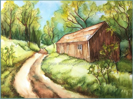
Summer and watercolors are inseparable

Summer and watercolor, paint more

A simple way of using watercolor

Summer and watercolor: that is such an artistic combination! Watercolor sketch, pen and watercolor or purely watercolor are excellent ways to paint summer scenes, summer flowers, summer landscapes and simply enjoy the outdoors and beauty. The easiest way to practice painting with watercolor is using pen and watercolor wash.

That enables us creating great composition and not caring too much about pencil lines and perfect application of watercolor.

I said it once and I would love to repeat it: pen and watercolor wash is a great technique for beginning watercolorists. Some like it so much that they stick to this technique and turn it into their personal style.

Save time, paint effortlessly

If you are afraid of drawing with pen, do the initial drawing with pencil. Afterwards, you can draw over with pen and delete everything else. Therefore, we have a beautiful and clean drawing in black ink, and the watercolor paper is not damaged.

The most exciting part is adding watercolor washes, as well as more detailed areas with more saturated paint. We can create a wonderful painting in less time this way because we do not need multi-step drawing transfer onto watercolor paper and it is much easier to know where to use paint because the black outline clearly identifies that.

Real subjects make good painting

Summer is definitely a very suitable time for practicing painting plants, flowers, vegetables, fruit and all kinds of landscapes and garden scenes. I find that implementing fence or corner of a building adds extra impact. White or grey fence looks great with flowers and leaves.

What to do with the background?

There are no strict rules about backgrounds and additional details. Very frequently, less is more. Whenever we can, we should simplify our scene and subject. Whether to include a detail or leave it out usually depends on our style, intention and skill level. Minimalist paintings look as great as detailed realistic paintings; there is no such a thing as mandatory inclusion of detail in a painting. Many beginning artists wonder: what should they do with the background: leave it as is, white, make it dark or add background shapes and colors? That, too, will depend on how you have captured the subject.

watercolor painting, flower painting, poppies
Summer poppies, 12 x 16 in or 30.5 x 40.5 cm

Less can be more

My personal point always is: let the painting or drawing tell you what else to do. It usually does when you look at it carefully and from some distance. Realistically, you should always look at your creation from some distance since being too close to it all the time makes us not notice flaws and strange areas which require improvement. Certainly, step back and have a look. If it is all flat and lacks any contrast, add some.

Don’t be afraid of dark colors in painting

I find that beginning artists are afraid of dark colors. Even when painting with acrylic where there is no threat of painting something too dark because you can always paint over, the first layers and make it noticeably lighter, new artists use no dark color. Having absolutely no dark colors and contrast reduces our ability to add volume and impact.

Patience and practice

We all want our art to be great and impressive. However, if you are new to some medium or absolutely new to drawing and painting, you have to bear in mind: nothing happens right away and with the first brush stroke. I have had absolute beginners who were somewhat disappointed that their first attempt wasn’t a masterpiece. Every skill takes time, efforts and work. However, not being satisfied with the first few drawings and sketches, is no reason to give up painting or drawing. You might be surprised how much better one becomes after a while.

Focus on potential

Focusing on perfection right away will cause you to be disappointed. Any artist will tell you that they have damaged, and thrown out lots and lots of initial sketches, painted over initial paintings, changed the layout and composition completely, switched to a different colors or tools. They have done many things before they have got their first good painting. Not every drawing or painting is or should be a masterwork. It should be a stepping stone on our way to better us, to better art which we have created.  We use our errors as a way of discovering how to achieve what we want and have intended.

If you love it, go for it

It doesn’t matter what somebody says about your drawing or painting. They might not be the best critics or they might also praise it too much.  Practice is practice, we have to spend time learning until we get where we want to be. Regardless of how somebody looks at your creation, regardless of how much they praise or criticize it, you have to be realistic and admit what is wrong and what is great to yourself. That will help keeping your assessment realistic. Do what you are good at. I hear frequently: I am very bad with whatever, I need to do that. Leave that for later when you have more experience. We should do everything we like and love, at least in art.

Application for art classes: Art classes

Copyright notice: Copyright of displayed paintings, drawings, images of work in progress and images of finished paintings belong to artist Inese Poga. The use of painting and drawing images is prohibited if I have not issued a written permission. That includes no pinning policy.

The power of line: how to create and use a drawing

From drawing to painting, power of line

The power of line

The power of line is huge. Simple sketches in pencil or pen look impressive and artistically interesting. We are born with the ability to draw, but we just lose it as we grow up and get older. In order to simply look at something and draw it, one must practice. It will not happen right away, it will not happen on its own. One also needs to know what they have to look for and what they need to notice.

Perfection or discovery

Cravings for perfection can be irresistible, therefore, many people take credits for a drawing which they have created by tracing a photo or reproducing it on a larger scale using grid, display on a wall. Some artists edit the photo to obtain parts of printer paper size, so that it is possible to put them together in a line drawing. The question is: is that really a drawing or a copy of photography? To me, the latter is true. I do assume anything a drawing when we look at our subject and then manually draw it on paper.

Our eyes get it right

Is drawing difficult? In fact, it isn’t, but it takes time and practice, and anything which is somewhat time-consuming isn’t loved much these days. The general opinion is usually that camera gets our subject right and we might not get the right proportions when drawing. That is true to some extent only. If the distance between camera and subject is small, or the distance within the view is huge, camera will produce wrong proportions.

How camera distorts image

Camera draws closer the front part of the view or subject. It widens the middle portion and creates much more distant background part. This is very easy to notice in case of water reflections or shadows. When artist follows a photo closely, not the actual view in nature, the reflections will be stretched out for miles which would never be the case with reflection in nature.

Don’t take a picture

Many instructions start with: take a picture. I would like to say: don’t do that if you ever want to learn drawing. We have to trust our eyes and ability to recreate the same proportion, edge and line relationship and color transitions without additional tools. However, to get to the level when one can do the so-called “blind drawing” (you do not persistently look at paper or canvas but rather at your subject), you have to practice. That means making decisions and allowing the eye-brain signals to be transmitted to our hand with pencil or brush.

We can do it

That also means trusting ourselves more than a camera or grid. It also takes practicing daily or weekly and, at the end, this activity improves the brain functionality, memory and flexibility to an incredibly high level. When we sometimes look at a drawing, it seems it didn’t take time or efforts. It is due to the fact, that good art shouldn’t exhibit artistic struggles and technical difficulties, but mood and atmosphere of the painted subject. When we get past these struggles, the real creation takes place.

The principles and methods of drawing

There is an interesting thing: people, who cannot draw anything yet, believe they have to practice drawing a particular subject: portrait, landscape, still life or flower. That is definitely not true because once you can draw, you can draw absolutely anything. The principles and methods are actually the same regardless of what we draw. You cannot skip understanding values, shadows, highlights, proportions, relationships, contrast, perspective and negative parts. That is what makes drawing a drawing and eventually painting a painting.

Functions of drawing

Drawing has very different functions in the creative process. If it is an independent work of art, it will go through many stages until it contains all the above mentioned elements. If it is a sketch for use later, we will include only the most important lines. If it is a value sketch for painting, we will pay special attention to values, contrast and shadows. If it is an outline drawing for watercolor, we will have only slightly visible lines.

The rural house watercolor is a large and attractive painting in spring colors

Not what you draw, but how you do it

Therefore, it is not that important what you draw, but how you do it. Trust the power of line. It is rewarding. Sketches must help you in the painting process later, there is no need to overwork them and prepare for framing. Technique matters, but doesn’t mean it is the most important part of drawing.

Get rid of eraser

How to get rid of eraser? If your intention is to draw, do it. Erasing everything and starting over for numerous times isn’t helpful. You simply have to forget the eraser at home, so that you do not have it with you. When something does not come out correct, start from scratch, not from adjusted lines. Use focusing ability instead of eraser.

Early spring, rural hills watercolor, size of this painting is 24 x 18 in or 61 x 45 cm.

Go reasonably large

Draw reasonably large subjects. Tiny things cannot show any shadows, values or important details. Drawing large isn’t more difficult, it is just a strange assumption and belief that handling a bigger subject is more complex. If the drawing is for creation of painting, large is much better. Unless you want to use magnifying glass, avoid details which are hardly visible because they don’t get noticed anyway. Keep details under control.

Manual drawing for artistic freedom

Drawing is a wonderful thing. It allows one not to use any additional devices. You won’t even need a camera if you have learned capturing the most important features of the subject. It also gives one a complete artistic freedom: skip whatever part does not improve your scene or subject or add whatever it seems to be missing. There are no restrictions. It is visible right away whether one was drawing from reality or they are modestly describing their perfected copy of a photo as a sketch from nature.

Sketch in actual size

I create pencil sketches in the actual size of painting: this time it was 20 x 24 inches or 61 x 51 cm. This drawing serves as a reference. Colors are all in my head and everything else what I need is in the sketch. I transfer it onto watercolor paper and then apply washes which get defined with every layer.

I take numerous pictures: with iPhone and with camera using different settings. However, I do not ever get the colors which are in the actual painting. Therefore, I’m trying to also take some pictures with background by placing something around the painting.

To learn sketching and drawing, please apply for April classes: Art classes

Who benefits from art and artists

Early spring along the creek, watercolor painting by Inese Poga

Artists work hard

When you look at art for sale, it can seem sometimes artists are out of touch with reality and ask an unreasonably high price for their art. It seems so. I once asked a lady who had stopped by at my studio: do you know anybody who would work for about a month, every day, 6-8 hours a day and then get for all this work 200 bucks minus cost of materials? It wasn’t that I tried to make her pay more, it is how long it takes me in average to paint something. She was a nice lady, and she honestly said she didn’t know anybody who would work on such terms. I could add to this that I don’t know either, except fellow artists who for different reasons undersell their art.

Who benefits from art and artists
A brief list of these who benefit not only from  full-time artists, but anybody who creates art and tries to sell their art, are companies which:
make pencils, papers, tracing papers, graphite papers, drawing sketching, watercolor and all kinds of art papers,
make canvas, canvas panels, canvas boards, stretcher bars and canvas fabric,
make paints, pigments, mediums for paints, solvents, varnishes, and all kinds of chemicals that are necessary for putting paint on canvas or paper at different stages or for preserving art,
make easels, supports,  frame and framing supply manufacturers, including mats, matting paper, glass, Plexiglas and similar materials.

Let’s add website and blog
Every artists needs a website or blog, as well as social media presentation, so there are numerous platforms and hosting businesses which sell everything from security certificates to software for managing website, hosting, themes, plugins and many tools in order the website stayed functional.
We should add companies which manufacture computers, tablets, laptops, cameras, video cameras and phones since we need to get the art image captured and transferred to online space.

Virtual and real space-related cost
Space-related cost involves quite many aspects: any landlord who leases studio or showroom space;
any utility provider who sells power, gas and water to the studio;
any show, gallery, exhibition, fair, including juried shows, online competitions and online shows which charge a fee for putting the artwork out there;
any online art sales or art print sales provider which charges membership fee and commission;
money collecting and payment processing companies, banks, etc. also benefit from artists and their work.

More expenses
That is not the entire list, mind you, and to some extent it is similar to expenses that are inevitable for any freelance or self-employed person. The creation of art is definitely at the higher end of expenses in regard to costs of materials and time consumption.
Artists obviously pay for paints, paper, canvasses, frames and framing, fees for shows and gallery representation and any utilities, as well as monthly payments for studio regardless of whether there is going to be some profit or not. Even when art ends up in the wastebasket, it still involves cost.

Product and demand
I know, anybody, who creates a product, must create it first and there is never a guarantee of selling it. However, most products which are 100% unique, handmade and original sell for much more than the materials and labor that goes into them. So, we have arrived at the most important question: who enables the artist to earn living? Who makes it possible for the artist to profit from their talent, work and efforts? That is, you, dear friend who loves art. These are people who collect art.

How does an artist earn income?
The artist can only profit from his or her clients, who purchase the work whether as a product with art image on or in it, or as an original painting and drawing. Therefore, all artists are looking out for people, who love and appreciate art. People, who have enough money and are willing to spend it not on food, not on outfit, not on make-up or furniture, but art. Art is not a medication and it won’t cover you as a blanket, but it can feel that way, too. I know people, who can stand for half an hour at some of my paintings, and they feel exactly that: warmth and energy, and healing power.

Think about it
I hope when you go to an art show next time and when you look at some painting, you will be aware that along with artist’s efforts, talent, time and soul, a lot of other expenses are included. That constitutes the invisible part of a painting which is quite frequently not covered at all.

Freelancing
Being a freelance writer and artist is not easy by any means. There is huge insecurity. I never know when a new work request arrives, I cannot guess with certainty when a painting will sell. I obviously cannot work when I’m not well, and that causes other problems. The domino effect.
Why to do this? At the present moment, this is the only option I have, and I just love creating art more than anything else.

A few watercolor paintings in fresh colors

I am presenting for reference a few large watercolor paintings which come as a result of many hours of work.

Landscape, artists create
Peaceful, summer lake watercolor, 20 x 16 in or 51 x 41 cm
Artists selling art
Mirror of spring, spring reflection watercolor painting, 24 x 18 in or 61 x 46 cm
Artists and creations
Early spring along the creek, watercolor is 24 x 20 in or 61 x 51 cm

I am not sure if I will post something else before I fly to Latvia next Monday. I unintentionally have chosen the full solar eclipse day, but who cares. I am happy to go on this trip and see my family.

Thanks for reading!

Summer flower watercolor paintings

Flower watercolor paintings

What happened to all good themes on WordPress.org?

I’ve been sitting at computer for too long. As I told before, I don’t have a better theme on my website right now for a very silly reason: I just can’t find a suitable one, it seems almost impossible. All of them look great as demos. Once I start to adapt them to what I need, I end up seeing that one page themes don’t work; themes overloaded with all kinds of fancy stuff don’t work. Also,  completely plain and flat themes don’t work, and so on. I tried 8 themes, lost money on one, and here I am: with the same Twenty seventeen.

No change is better than bad change

I decided to leave it as is because while I was doing my theme adjustments, I worked as a slave for two weeks, 14 hours a day. That was affecting my life and everything else I had to do. It’s summer after all, and one is not supposed to spend it at computer. I am going to Latvia soon, but prospects of traveling without cash are not very attractive. I will just have to make some.

Purple variety, delicious apples’ painting

Local sales

Once again, I will try to do something also locally which is very unlikely to be a successful thing because this neighborhood is quite dead in summer. I will try to sell something also over the internet from this same site.

Taking pictures of art

My biggest problem has been inability to capture the painting images. This problem has persisted for many years. I don’t think it’s only mine problem. Camera looks at painting differently, and the color balance depends on colors in painting. Blue, grey and blue green colors look better on pictures. Red, orange and yellow colors are problematic. I have paintings which have a lot of red, and I cannot show them online because there’s shine on it, It is usually impossible to bring back the color balance with editing.

Summer watercolor paintings

Taking pictures of art in context and with background

I have noticed that watercolor artists take pictures of their paintings using contextual background. I started to take such pictures of my art intuitively, some 8 years ago or so. I noticed very soon that everything with background looked fine. I mean, paintings regained their natural colors.

Size is not visible on internet display

That also gives some idea about the size because it is quite annoying to see how my very large art is displayed smaller than my small art on some sites. Just placing something next to painting or having surroundings show behind painting or when art is on the wall results in a photo which has well balanced colors.

Taking pictures of art and displaying online

This particular theme does not allow also displaying everything as I would love to. The featured image becomes too large. I tried to add my own css when doing theme adjustments. I made the blog posts page larger size, but decreasing the widget area resulted in losing the number of followers. I will have to live with this display for a while because too much editing the style caused all content text disappearing completely. I have real fun here!

Nothing compares to real painting

Most art looks better in reality. It can be so annoying at times that after taking about 30 pictures of a painting not even one is good enough to post.

Flowers and fruit: summer compositions

I appreciate your interest

Anyway, have a look at my art and I will also post more exercises for those, who love painting with watercolor and are learning and experimenting with sketching and watercolor. Maybe I should make a specific Facebook page for that? We’ll see how it goes. I believe pictures of paintings look better in context and with background. Some are above and below.

Good luck!

Some of my paintings for sale: Shop art

Art prints and art products on FAA

Art collections by Inese Poga

Draw the line: put things in perspective

Watercolor, perspective, painting by Inese Poga

Purpose of linear perspective in painting

Perspective in art is much easier to implement than perspective in life. In fact, there is nothing much to it as far as we are aware of  how it works and what it does for a painting or drawing. Linear perspective creates depth and dimension in any drawing and painting which deals with suitable subject. Traditional linear perspective uses size, overlap of objects and their placement in composition, as well as convergence of lines.

Black pen drawing of simplified 2-point perspective building

Where to use it

If you love landscape, street scenes, rural scenes with farms and barns, simple roads, streams or rivers and so forth, you will need to implement linear and atmospheric perspective because they both contribute to dimension and volume of your painting. You will also use color values accordingly to perspective principles. If you are drawing and painting outdoors, you are most likely applying some perspective already.

Old countryside house in pen and watercolor, 18 x 12 in or 46 x 30.5 cm

Vanishing points and front view

Some people are confused: how many vanishing points to use: 1, 2 or even more? The answer is that will depend on the placement of your shapes and forms on different planes. 1-point perspective uses 1 vanishing point on the horizon or reference line. Horizon line can be called eye-level, but I like to call it reference line. You have to remember that vertical lines are parallel to the sides of your paper (if it’s straight) to make look building stand up correctly. Horizontal line creates 90 degree angle with the vertical line in front view. Horizontal lines of front view are parallel to the bottom and top of your paper. Therefore, in 1-point perspective, the straight lines at the bottom of your building and corresponding lines higher up will always create a 90 degree angle with the vertical line.

1-point perspective in landscape

Most often, we use 1-point perspective with roads, streams, tree and fence lines and buildings on both or one side of a road, that is, with views where something disappears in the distance. That creates an easy perceivable and visually attractive composition which is a breeze to create. In 1-point perspective, all lines which lead into distance, meet in the vanishing point. The front angles of the building on the respective plane are 90 degree angles. It sounds more complicated than it is when you draw it. Start with closest end of the building, drawing a rectangle. Connect the points on one vertical line (in my case the left side where I mark height of any element) to the vanishing point.

Pen and watercolor wash of barn, 16 x 12 in or 41 x 30.5 cm

2-point perspective uses respectively 2 vanishing points.

My drawing of neighbor’s house

Plein-air drawing, 2-point perspective. Photo does not show all lines correctly since camera draws the front edge closer. To draw it correctly, vanishing points on reference line are placed outside the drawing. That we do always when the  subject is large. I usually draw intuitively since I know where approximately these lines meet and where the vanishing points are. Starting out? Mark up vanishing points on each side and connect with respective points on vertical lines. I teach this all in my private classes because it is simply not easy to describe.

Pen and watercolor 2-point perspective sketch, it was mostly done outdoors, since this building is next to my studio entrance.

Many buildings in a landscape or street scene

When drawing close-ups of buildings or placing many scattered buildings in composition, we use rather 2-point (angular) perspective. We use drawing separate buildings most often 2 vanishing points. We adjust the eye level or reference line placement as needed. It can be higher or lower depending on your view. We can move it up or down, and we should use this feature in our favor. That will allow achieving plenty of depth and dimension.

3 vanishing points in one-point or two-point perspective

When some buildings are close, some distant or scattered all around, you could use 3 vanishing points. It does not mean that your drawing becomes extremely complex. It means that you will have freedom to place things in your composition wherever you want them.

Where to place rooftop?

Often, demo drawings that involve 2-point perspective do not explain that the rooftop line runs through one vanishing point. That was also the most confusing part for students since they had a problem placing the roofline where it belongs. Please enjoy the recent paintings and sketches which involve perspective. I will prepare online materials for understanding better how to create linear perspective in drawing or painting.

Perpendicular and parallel lines

The most important aspect is to understand what lines are perpendicular, what parallel, what is obtuse angle, right angle and acute angle. Remembering basics of geometry is really helpful because perspective in drawing is simply achieved once you know how to create it. I am posting some of my recent works that involve creating perspective to illustrate the concept.

Uphill, watercolor painting of rural house, size of this painting is 21.5 x 16.5 in or 54.5 x 42 cm

Outdoor painting

Many drawings, sketches and watercolor paintings are done outdoors or plein-air. Perspective is an important part of any painting, sketch or drawing which displays buildings, street views, roads, fences, bridges and similar subjects. Learning how to create perspective is not difficult or overwhelming. You really need to master perspective if you ever do a realistic painting or drawing with buildings and man-made structures.

More about this: Power of line

and how to start sketching: How to start sketching

Visit the online print store:

Art collections by Inese Poga