From drawing and sketching to painting

Drawing and sketching house entrance

Positive impact of drawing and sketching

As much as we want everything immediately these days, skills and abilities take time and practice. Starting with drawing and sketching is a great way to understand what painting consists of. It’s easy to learn principles of good composition and potential color combinations using your sketch. It becomes visible right away what to keep and what to omit which is very important.

Black pen outline and big paper

Using black pen or ink outline enables beginners in watercolor painting get good results faster. The black outline indicates clearly where you go with watercolor paint. I would always recommend using big and large watercolor paper for this task. The smallest size paper which yields good results is 11 x 14” and 12 x 16”. On a tiny painting, there’s no space for many important aspects of painting.

Good quality watercolor paints

Practicing watercolor paint application is very useful for anybody who intends to try watercolor painting. Having a decent size paint wells is a must. The tiny half-pans do not allow getting enough paint to cover larger area, paints bleed into each other and get polluted. To correct any unintentional or wrong spots use paper towel sheet, good quality paper towel.

Layering and lifting watercolor paint

Watercolor becomes lighter as it dries, therefore, it can be necessary going over with more paint layers. When the previous layer is dry, the next layer will not disturb anything you painted before. Lifting watercolor paint is a very useful technique, and we usually apply it frequently. The one thing you don’t want on your watercolor painting is streaky and uneven coverage with undiluted paint blobs.

Building skills with drawing and sketching

Drawing and sketching teach us many aspects of painting, and not only watercolor painting. While many beginners believe it’s a waste of time, I strongly disagree. You paint as you have drawn and visualized whatever your subject. It also helps avoiding mistakes. Plus, it’s a fantastic practice. Drawing and sketch can be framed just as paintings. Drawing and sketch is also your best reference for painting.

P.S. Due to my health conditions, I didn’t post anything for a long time. As my health improves and pain decreases, I certainly hope the next post will follow quite soon, not after a year.

Creation as art therapy

Colors for art therapy

Harmony and balance – main goal of creation as art therapy

To regain harmony, balance and self-fulfillment, many people are trying to find simple ways to cure their stresses and change the rushed lifestyle in nowadays unforgiving world. The most healing, as well as most accessible path is using creation as art therapy. You don’t have to be an artist to find huge satisfaction, calmness and feeling whole again since creation of art, painting, drawing, sketch is already art therapy. If you never tried, maybe you should do that right now while it’s cold and not that great outdoors.

The healing potential of creation as art therapy

The healing aspect of creation is based on the idea that it involves mind, soul, emotions, feelings, activation of memory pathways, harmonizing movements of hand with brush or pencil, thus, stimulating self-expression, intuition and getting in contact with person’s inner self. All of that gives us a chance to free ourselves from never ending stresses, being in competition with everybody else, and getting rid of emotional blocks. The other aspects of creation of art are ability to focus, improvement of memory and decision making.

Relaxing creativity

Creation as art therapy involves fantastic relaxing potential. Especially, if you prefer using color as the main feature in art. The colors we feel as ours, disclose the subconscious state of our mind and lead to transforming experience. Creation of art involves all of our brain processes, and that manifests as a healing effect and feeling of inner balance. Participation in art classes is one way to facilitate the creativity and learn how to implement it in our life.

Power of colors

Each color possesses unique energy which affects us. Working with colors releases different energies. For painting, we usually go either with color of our subject and reference, or choose it intuitively which is what I do most often. Choice of color can be frequently subconscious – we feel attracted to some colors and avoid using others. The same goes for subjects which we feel are ours.

Blue and green – colors of life and harmony

Blue color calms and facilitates peacefulness decreasing stress and anxiety. Look at the blue sky, which represents endless calm. We surely can paint sky and water as blue as we want. Green color symbolizes the energy of nature, harmony and balance, healing and increasing the feeling of the inner calm. Green color means life and renewal, just like in spring everything comes back to life. Green is dominant in nature during spring and summer, it’s the most healing color, the best art therapy.

Orange and red for passion

Orange color is the color of enthusiasm, living energy and creative intentions, it gives us vitality, helping to open our mind to new ideas. Red color activates our energy, power and passion, especially passion to live and create. Red color also can be a manifestation of subdued emotions and inner restlessness. I have rarely used only red, orange or yellow, but these colors are very essential for fall landscapes where they are represented in abundance.

Yellow for joy, purple for magic

Yellow color is associated with joy, self-awareness, mental clarity, it facilitates positive attitude and perception. Yellow brightens our space and sparkles up feeling of pleasure in our mind. Having different shades of good quality yellow paint is absolutely crucial for any painting. Purple is color of spirituality, intuition and depth of soul. Color of mystery and magic. I have rarely used purple as a dominant color, but it’s useful for softening green. Purple has its place in art therapy.

White and black

White means clarity and purity, new beginnings. White is unavoidable in art. We need to brighten and lighten other colors, and pure white is very important for watercolor and acrylic painting. Black color represents completeness and strongly indicates value, shape and form in art. I don’t use black color in watercolor at all, but as a mixing component in acrylic. Strong indication of values is important in any painting.

Painting, creating and using colors

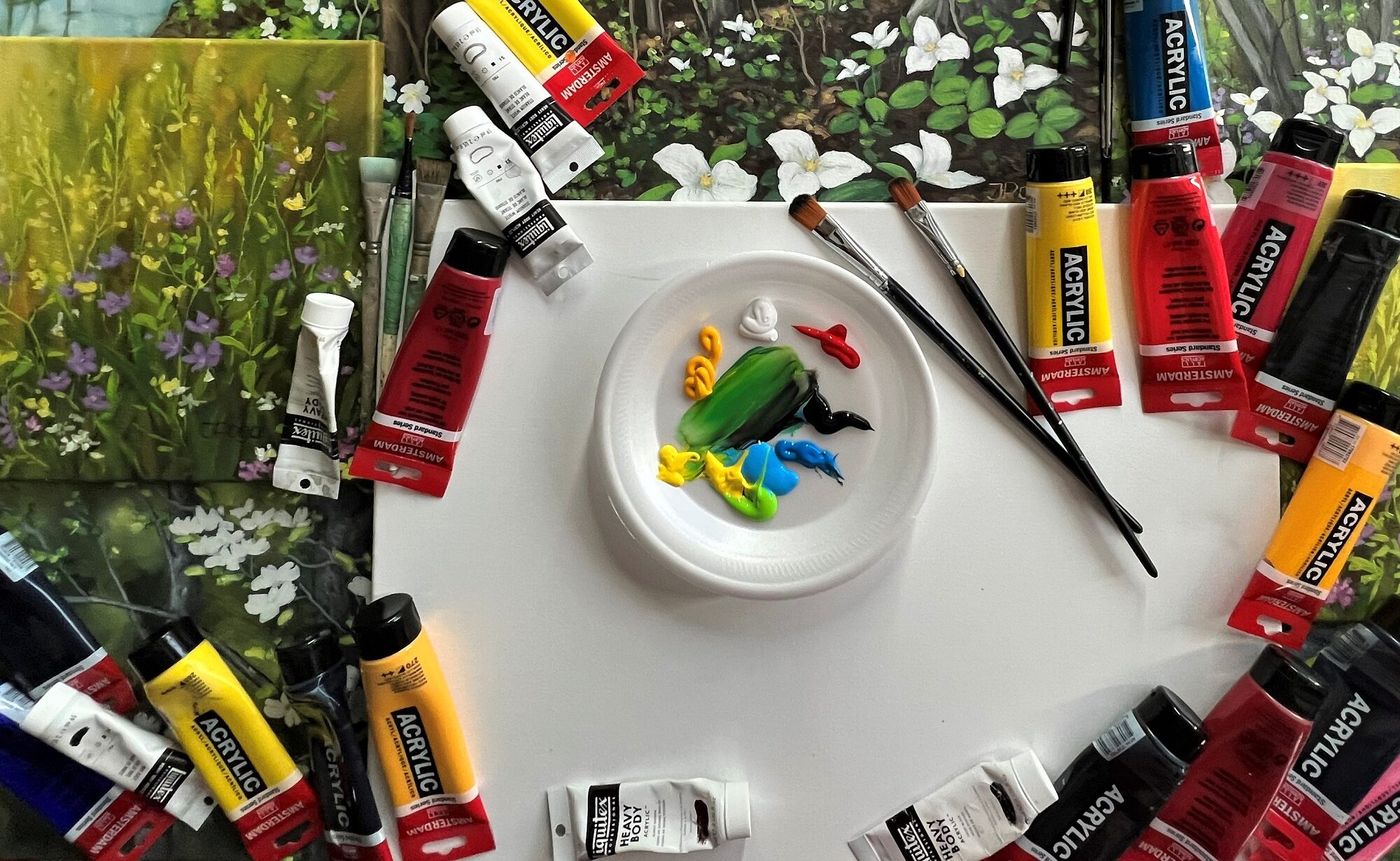
When we create a painting, we rarely use paint straight from the tube. It’s important our painting has light and dark values and warm and cold colors. Therefore, most often it is a mix of colors and different shades. Yet, the overall impression usually shows a tendency towards some particular color palette, like I love combining all kinds of green with blue, white and yellow. Fresh and uplifting, at the same time, emotionally loaded and peaceful. Fall paintings have numerous red, orange, yellow and mixed shades. Saturated colors, warm, bright and vibrant.

Different preferences

I have written before about my grey and subdued color periods, as well as blue, green and red. Over time, the perception of color becomes very refined. The color choice usually reflects the mood of that time. Grey looks fantastic in art. Sometimes less color makes painting much better. However, there are seasons when I feel I need the brightness, the strong, bold colors. Nobody says we have to stick to something one. In art, we experiment, explore and test. Time spent painting becomes meditation and art therapy.

Group art classes

Private art lessons

Shop original acrylic paintings

Creek in fall colors and rushing stream

Autumn creek, fall colors watercolor painting

Love challenge

Many years ago, I had done some rough sketch with watercolor pencils on a 24 x 18” Arches paper. Probably in 2009 or 2010. We used to travel a lot back then. The sketch was of a creek with trees in fall colors. While the photo of step 1 is very white and light in value, the actual sketch was not. You might know that it’s not possible to erase watercolor pencil lines. I didn’t like everything in that sketch, but I love challenge. I decided let’s try to make out something of this creek in fall colors.

Techniques I used

I don’t use masking fluid, but rather prefer painting large and even huge shapes so that it’s possible to paint around whatever I need to. Good, firm and thick cold press watercolor paper allows for lifting and adjustment, as well as layering many times over the basic color. Rocks are great for application of salt. When applying salt, one has to be mindful of timing, there’s fairly narrow window when this technique works. If the rocks are really large and the entire painting is large, we can do numerous extra things.

Changing and correcting watercolor painting

The photos of painting steps of this creek in fall colors might not have the exact colors and contrast, however they give an idea of how one can change and improve watercolor painting even when initial shapes are not correct. I’m reading in Facebook groups how people describe watercolor as difficult and something one cannot correct. That’s wrong! If you paint large and on good paper, you can change and correct everything. The best colors to lift are all blue shades, even Payne’s grey can be lifted to almost white paper.

Use live art classes

I teach all painting techniques in my live art classes. I can see that online class doesn’t give one proper understanding of what and how to use, what timing should be applied, how to use paper towel, lifting and layering and what colors work and what don’t. It was a difficult picture to take photos of because of the distinct cool and very warm colors. Their use is absolutely intentional. That’s also important aspect – color temperature.

Imperfections are fine

Just like always, my photos could better, but I am going ahead and publishing the creek in fall colors. The reason I want to paint somewhat realistic watercolors, even imaginative ones is that abstracts are not challenging enough. I’m not worried also that absolutely everything isn’t perfect. When it comes to painting, I’m all for process and for challenge. If it’s easy, there are no thrills for me.

For beginners in watercolor painting

If you are a beginner and want to paint with watercolor, go big. You are not going to ever leant painting with tiny brushes on tiny paper. There’s simply no space for any effects. Also, using tutorials and watching somebody else paint isn’t going to help much. Brush and paints are important, but what matters most, is the hand that moves the brush. I would like to remind how important is value sketch in large size. Contrast and values are what make painting appear three-dimensional. To check your values, turn the painting in black and white. If it still shows the subject correctly, values are right, too.

Enjoy the art!

Painting without restrictions, spring landscape

Painting in progress, Highland creek landscape

Being in spring landscape

What to do during the dull and dark February days? Probably, just keep painting. Acrylic painting is a bit more difficult with heating on, but it is also very rewarding. I pick myself up and place in the middle of spring. We used to go for walks along the Highland creek which offers attractive views and many varieties of trees, wild plants, chance to watch animals, jump over rocks and rushing water. Creek is wide in the middle part and water stays quite still in some spots. This is like mental transition in time and to another place. Thus, spring landscape is born.

Central part of Highland creek flood water painting

Imaginated reality

As you know, art has no restrictions. That includes the painting subject, colors we use, parts we paint and parts we don’t. I’m usually not that worried about how realistic something looks when painted. There must be some joy and fun put into every brushstroke. I usually paint as I see something in my head. When I look at empty canvas, I can easily visualize what is going to be there, in this spring landscape for instance. Similar to when we have a piece of fabric and we can imagine how the ready outfit will look. Imagination has no borders, too.

Top part of Highland creek flood water painting

Spring landscape as painting subject

This Highland creek flood water painting was done for the private art classes. I thought spring landscape was very fitting since we can paint much less of it or add much more to any part. We can leave the distant part completely abstract. Well, my student was impatient and here and there jumped over the gradual steps which processing an acrylic painting requires. My demo steps got jumpy, too, but, nevertheless, this painting was brought to completion just a few days ago. What you are seeing, however, is not the painting, but images of it. I straggled getting all parts of it onto pictures.

See painting steps above

Getting correct colors in acrylic painting

What’s most important for me personally, is whether the mood in an artwork can move us, inspire us, make us want to be there, in that place which doesn’t actually exist in the real world. I am trying to also teach my students patience and correct use of acrylic paints. While any wet acrylic painting might look perfectly right, it will definitely dry darker. The weaker the paint we use, the darker our painting might become. I regret noticing how Liquitex heavy body professional grade paints have lost some of their quality over years. That refers to Titanium white and yellow shades.

Close-up of front part

The usual acrylic painting principles

Regardless of our artistic intention, we always work from dark to light in acrylic, always from underneath upwards, always from back to front. With heating on, acrylic paint can dry immediately, therefore, we glaze separate parts and work in small segments. The lore layers acrylic painting has, the better it will look. That especially refers to the moment when somebody sees the actual painting in person. I sometimes go over even the final layers if the paint has become too dull in some spots.

Highland creek flood water, acrylic painting 24 x 18″ or 61 x 46 cm

Place yourself in this spring landscape

I hope you love this spring landscape and its mood. I believe you’d hear birds singing and water rushing over wet rocks and grasses if you are able to forget the surroundings for a moment and be immersed in this painting. It’s in great size, not too huge, not too tiny, 24 x 18″ or 61 x 46 cm. The steep vertical format adds a good quality to this spring landscape and pushes compositionally important elements close to the viewer.

Just like always, thanks if you read my post! I intend to catch up with likes and comments.

Private art lessons

Group art classes

Art collections by Inese Poga

Pansy smiles, once again, and new art classes

Yellow pansies, floral watercolor

Pansies, they smile for sure

My garden provides me will all painting subjects which I usually use for floral and still life paintings. I can also see quite a landscape from the second-floor balcony, so I’m all set up for any nature painting without needing to take any photos. First of all, with nowadays cameras, perspective is completely distorted, it would damage drawing or painting to huge extent. Colors are practically never true, and that is a reason good enough to rely rather on our own eyes. This time I’m presenting the new smiling yellow pansy faces surrounded by great shapes of leaves and abstracted background.

Never-ending supply of art ideas

We had big problems buying any seeds this past spring, therefore, I have mostly what grows from my own seeds and flowers and veggies which planted themselves. I got 2 sets of pansies. The one which I painted this time, was larger. It had interesting colors in the middle: not completely purple and not completely dark red in the lower part. Yellow is not that difficult color to paint as it is very annoying getting pictures of it. I can never go wrong with art ideas which grow all around the garden. It’s never-ending inspiration, always something new and more beautiful than before.

More art, less reality

When I draw or paint something, I usually change a lot from what it is in reality. I want on my painting more art, more me, more my style, and less reality. That doesn’t mean I will paint my subject in a completely abstract manner. The reason is there’s way too much abstract art already, and also – it is much easier to work on one’s style and maintain it when using recognizable and nature-like things. Pansies are a convenient subject for painting, especially when you have some around. For photo-taking reasons, I will make next painting pink or red because watercolors in such palette shades are much easier captured with any camera.

You see what you see

I regret that most of you will ever see only images of my art. I dare saying that you will never know what I and how I paint in reality. I surely can tell you that the camera made the light-yellow spaces white and caused the darker areas look like outline which they are not, I can tell that my colors are crafted and very balanced, but you see what you see. Plus, there’s no perception of size and its impact. It is again a 24 x 18 in or 61 x 46 cm painting, and that is quite large for watercolor. As it leans against the white support board, it lights up the entire studio. It’s cloudy and rainy today and this painting just shines as extra light source.

Pansy smiles, purple hearts, watercolor 24 x 18 in or 61 x 46 cm

New live art classes

After a long interruption of almost 2 years, I’m resuming live art classes in a very cozy outdoor space which is surrounded by blooming and green plants. This feature will add more safety to participants. It’s just so that I haven’t seen that many yet. To be honest, I’ve never met or had a student who learned mastering their style or medium online. I’ve written about that before: it’s one-sided, and that’s the problem. The human perception is very distinctive when it comes to any art concepts, therefore, everybody understands and applies the same thing in all kinds of ways, and rarely – correctly. In my mind, there’s nothing which can replace a real, live interaction, but that’s just my opinion. I suppose for drawing and painting animated outline drawing or extra simplified watercolor wash, anything is fine.

Real classes versus online: Compare

Mastering medium: Learn more

If you dream to become a master of your medium, you need a real art class. Apply here; Art classes