Watercolor, beating the blues with art

Sunny spring creek watercolor

Bright and sunny watercolor art

On TV, they were talking about winter blues. How this dull and wet January weather makes people feel down and upset. Our mind tells us that spring is far away, and to make everything worse, the sky cries with us. Bright and sunny watercolor art is my personal cure, my response to mood swings and upset mind. I paint the places where I want to be and flowers which will start in April or May.

Uplifting creativity

Not all people are artists, but many have paint sets at their disposal. Brushing bright, sunny colors on paper or canvas makes a big difference. It’s an immersive activity which allows to create our own imagined reality, very distinctive from the current settings. This year has been tough so far, so taking our mind off the painful and upsetting matters is vitally important.

New large-size watercolor art

All of these watercolor paintings are the same size – 24 x 18 inches or 61 x 46 cm. Well, to express ourselves, we need space. Tiny paper just won’t do that for you. It’s not cotton paper I used for these paintings. All of our art stores are closed now, and that leaves online shopping which I dislike. Paper is a very important part of watercolor painting, and each paper acts differently. This paper allows lifting paint easily, but it’s very problematic when adding paint layers.

Spring pansies, 24 x 18″ watercolor painting

Watercolor painting with pansies was started in the winter of 2021. So, it sat in a folder until I decided to add a few layers of paint and finish it up. Photos show way more white space, and I just cannot do anything about it. That’s how phone camera acts when there are white or light areas. Just imagine more purple and pink color on blooms because that’s how they look. Anyway, pansy blooms make a great subject in all regards. Use any color, any number and view of blooms.

Early spring flood, 24 x 18″ watercolor painting

The Early spring flood is based on views around our place. It’s a painting where you just throw on colors – Payne’s grey, Cobalt blue, Burnt sienna, Green gold, some yellow and Burnt umber. This all mixes itself on paper and then we swipe clean the areas which we would prefer to be white. We outline the trees, add leaves, wash on more color and sprinkle with a little of leaf green.

Watercolor wash and color

It is much easier to create watercolor paint washes on cotton paper, but if you don’t have it, any firm and thick watercolor paper will do. It needs to be thick and heavy since thin paper just rolls off and buckles. It was tricky to get any pictures of this painting since I don’t have good photographing light, and it’s been cloudy and very dark almost every single day. I love the dreamy quality of this painting, although I couldn’t get it on pictures. Colors are balanced – I used warm and cool shades to create the early spring mood.

Sunny spring creek, 24 x 18″ watercolor painting

I started the Spring creek painting (one more!) for a private art class last spring. It was half-done, just as many of art classes paintings are. It took me a while to get back to it, but I am very satisfied with the play of colors and placement of details. This painting is done with Cobalt and Brilliant blue, Burnt umber, burnt sienna, Lemon and Cadmium yellow, as well as Raw sienna and Sap green and little bit of Payne’s grey. This painting involves quite many layers.

Bright and happy art reality

I’d say these paintings show a very bright and happy place and that’s where I reside when I don’t have to deal with daily chores and other issues. It’s a perfect escape from daily routines, a perfect way to beat the winter blues. I think it’s time to write a new guidance for beginning artists. Trust me, tutorials cannot teach much about painting as such since it’s always something a particular person prefers and does. When we learn paint, we decide on everything – style, colors and subject, but tutorial requires to simply follow and copy.

I hope you’re dealing well with everything which comes your way. Spring will arrive eventually. Thanks for reading!

Art prints: Art collections by Inese Poga

Painting classes: Group art classes

My large sketchbook and ink drawings

Winter landscape, ink drawing

Sketchbook as collection of ink and pencil drawings

My sketchbook is large 24 x 18 inches or 61 x 46 cm. It actually feels big and heavy. The tiny pocket-size sketchbooks don’t work for me. Why? If I get a good sketch and it has potential to be turned into watercolor or acrylic painting, I just trace the outline onto the respective surface. The initial sketch serves as a fantastic reference with all shadows, perspective lines and mood, as well. Much better reference than photo. As you might know, color is secondary, and values are primary when it comes to painting. Therefore, my huge sketchbook becomes a great collection of potential large size art. Some of this art is practically a finished artwork.

Advantage of ink and pencil drawing

Drawing is relaxing and it doesn’t require proper timing which is absolutely necessary for watercolor or acrylic painting because correct timing directly affects the result. For example, you squeezed out a lot of paint in order to paint for a few hours. Something happens, and the painting session is cut short. Paint dries and cannot be rescued and you will need to paint over a few areas, but sometimes – the entire surface. With ink or pencil drawing in our sketchbook, nothing dries out, nothing needs doing over, so you just pick up where you left it before. I consider this a big advantage.

Best subjects for drawing

I’ve always loved drawing buildings. And still life. Flowers are fine, as well. My huge sketchbook has numerous drawings of these subjects. For me, it’s important that I don’t need a photo. I rather construct the subject and add whatever needs adding as I go. I call that artistic freedom. I have a complete control over what I want to be on my paper. That is why my subjects often involve only things which I see around and have in the garden or house. Simple, easy and very manageable. Buildings, still life items, landscapes, flowers: they all can be made multidimensional on a flat paper.

We can do well without devices

Since technological advance has been immense, people do manual drawing rarely. They don’t have to manually write either, so the ability to re-create our idea, vision, imagination and reality is declining. The correlation between devices and use of camera is very clear when it comes to manual drawing. The more devices somebody uses to create their art, the less of observational drawing ability they have. I suppose, our brain dismisses everything we don’t engage. Why to stress out if you don’t have to?

Maybe try it

I can make these conclusions because I’ve watched how people go about manual drawing for many decades. What are their strengths and failures, how they tackle dimension, values and shapes. Devices have advanced a lot, but humans? Humans not that much. We delegate anything we cannot do well to devices since there’s a wide choice of them. However, manual observational drawing is an extremely rewarding experience. Large drawings in a big sketchbook can become the best artistic experience.

Large size makes all the difference

It’s the most fantastic feeling. We have the blank sheet of paper. I prefer large one for many reasons. We just play around and implement whatever we feel like. Using soft lines, then moving to stronger values and lines. All of a sudden, the image emerges. Just some shades of black and grey and the white of paper. That’s all it takes. Sometimes it becomes a fantastic drawing where one can literary participate in the scene. If you want to learn drawing, trust me – go big. Use the 24 x 18-inch sketchbook. Want to advance faster, draw large images. I also used Micron archival ink pen.

I hope you enjoyed this article!

Playing with green color

Green spring landscape, painting in progress

Green is a color which we feel extremely attracted to in spring. I do feel that way, and maybe you do, as well, if you’ve had many months of grey and white view out of your window. I celebrate the return of green color since it uplifts my mood and promises nicer days ahead.

There are numerous concepts and assumptions about using green in art. Many artists avoid it almost completely not be accused mixing their colors properly. Just like with everything else, it’s better to have our own take on that and experiment.

For acrylic painting, there’ s practically no need to buy green paint. Why? Depending on your personal preference, it’s possible to mix up any green shade from other colors, including three primary colors. I don’t like aqua and phthalo too much, and although, they are strong and good for cooler areas, I prefer using the quieter tones.

After 5 layers are applied on the textured background

I love black plus yellow plus touch of blue, or blue plus burnt sienna and touch of yellow. Here and there simple blue plus yellow work well. The thing is we can have cold and warm yellow and very cold and warmer blue and that changes the green we are having. Every one of colors we get has some good potential for applying it. Where? It always depends on the project, intention and technique.

After 7 layers of paint or so

It is advisable to break up the green spaces with calming tones of purple, red or cool/warm brown. My most favorite set of basic colors for spring is blue, green, grey and some warm brown, burnt sienna or white. It is a calming combination and surely conveys the concept of an artwork well.

After adding light color to selected areas

I had a 24 x 20 in or 61 x 51 cm canvas from 2015. Everything is expensive right now, and that is an extremely high-quality canvas. I cannot recall what exactly my idea back then in 2015 was, but I decided to reuse it. This canvas had quite visible textures underneath of a few layers of grey/green/blue colors. I couldn’t change the tree shapes or location dramatically, the same goes for the water patch. Therefore, I adjusted the textured image and after a few layers it started to come to life.

It’s interesting how many starting-out artists believe they’ve got to finish their painting in one sitting. That is the damaging impact of paint nights which are not art classes, but entertainment, and tutorials which use rather tiny canvas or paper. If the size of painting is quite large, it is physically impossible. Every single spot need attention and work. Acrylic paint requires timing the paint application. That means, we cover some areas very quickly and for some – we wait until the previous layers are dry. That way we get our colors to shine and shapes to work well. That translates as painting in small segments and retuning to them layer after layer.

I called this painting “The moment before”. That includes everything that happens before the nature explodes in brilliance of blooms and abundance of green in leaves and grasses. The photos are taken with iPhone and the camera of 13 Pro Max is quite disappointing. The actual painting has no real yellow in it, and the green is well-coordinated in cool and warm areas. You might not see it that way, but anyway, that’s how it is.

The moment before, 24 x 20 in or 61 x 51 cm. Enjoy!

And don’t forget to sign up for art classes: Group art classes

And look at other art for sale: Shop original acrylic paintings

Spring edition, moving art studio

Moving art studio

My art studio is moving again, indeed, it has happened so many times during the recent years. I’ve moved three times since 2018 and now I have to do that again. While it sounds quite simple, it actually isn’t. The toughest part is finding a place and qualify for it. That requires mountains of paperwork, numerous hours of printing, scanning, signing, sending documents and so forth. That is the reason I hardly looked at the internet, any social media or blog sites. There wasn’t enough time in a day to cope with all that, and nothing was left for painting, unfortunately.

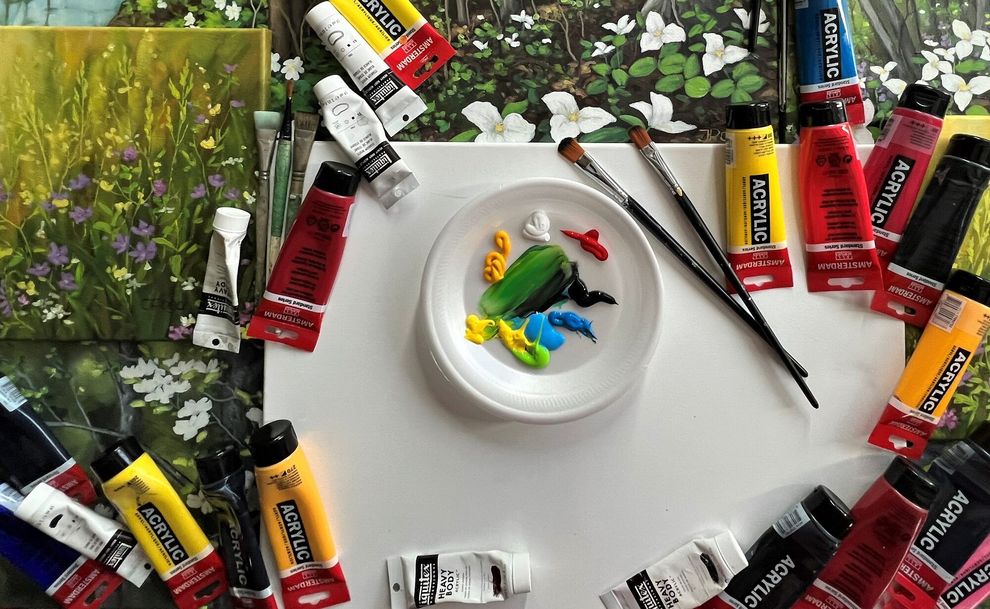
The Amsterdam paint tubes are added for color balance in photos, I use Liquitex for painting.

I did try to catch up with the artistic side, I sure did. However, that mostly resulted in wasted paint and a bit of frustration. As soon as I squeezed out acrylic paint and got in the mood for painting, the phone rang or I received a message, we have to go: to see a place, to meet somebody, to do whatever, and there was no other way around it. As you know, acrylic paint dries very fast, and even when preserving some in a tight container, it doesn’t work quite well as the fresh one.

I’m really hooked on the moment when nature awakes. The most fantastic view for me can be a tiny sprout breaking through the soil and greeting the sunshine. The first wild flowers are such a welcome sight! Strength to overcome the freeze and courage to break through impossible obstacles: that is what grasses and wild flowers have. I cannot resist, I return to wildflowers in spring settings every year.

One of my most favorite color combinations involves earthy tones, many shades of green as in sprouts, young leaves and grasses, blue patches of sky, as well as bright white, blue and pink of the wildflowers. According to such palette, I paint some knew dreamscape which I most often have seen only in imagination or which is stored in my memory chambers.

My art studio in this big house had to be adjusted and the actual painting space was sparse. As you might know from my previous posts, I usually paint only by daylight. There have been times when I have to add evenings, but I try to avoid painting at night when artificial light is required. It could be my eyesight which dictates that, but I am very sure that for true color match we need the daylight.

So, the art studio is on the move again, and I have started to pack up a few things. Very large and small paintings will be moved first, as well as part of my countless brushes and art supplies. I would love to sell a few more paintings, but I don’t have much time for advertising at the moment. We will be moving 9 large rooms into 5 rooms, only one of which is large. My art studio is going to be arranged there, in the largest room. Daylight will be much better in the new place, however. It’s an older building with large windows, lots of character and huge backyard. That is such a luxury nowadays!

My best guess is everything will be ready around April 15, and that’s when I can start with my own paintings and art classes. Until then, – I go through moving troubles, packing and unpackaging, sorting, cleaning and being busy with all kinds of things which are not necessarily art related. There will be moment when we won’t have internet yet, and when I am all set up, I will come up with my newest discoveries in painting. You can still scroll through my blog which documents all art studio moves, gives lots of advice for new and established artists and offers excellent quality art at great prices. Stay well! I’d love to hear from you!

Special art offers

Original watercolor paintings for sale

Shop original acrylic paintings

Art gifts and art prints on FAA:

Art collections by Inese Poga

Pansy smiles, once again, and new art classes

Yellow pansies, floral watercolor

Pansies, they smile for sure

My garden provides me will all painting subjects which I usually use for floral and still life paintings. I can also see quite a landscape from the second-floor balcony, so I’m all set up for any nature painting without needing to take any photos. First of all, with nowadays cameras, perspective is completely distorted, it would damage drawing or painting to huge extent. Colors are practically never true, and that is a reason good enough to rely rather on our own eyes. This time I’m presenting the new smiling yellow pansy faces surrounded by great shapes of leaves and abstracted background.

Never-ending supply of art ideas

We had big problems buying any seeds this past spring, therefore, I have mostly what grows from my own seeds and flowers and veggies which planted themselves. I got 2 sets of pansies. The one which I painted this time, was larger. It had interesting colors in the middle: not completely purple and not completely dark red in the lower part. Yellow is not that difficult color to paint as it is very annoying getting pictures of it. I can never go wrong with art ideas which grow all around the garden. It’s never-ending inspiration, always something new and more beautiful than before.

More art, less reality

When I draw or paint something, I usually change a lot from what it is in reality. I want on my painting more art, more me, more my style, and less reality. That doesn’t mean I will paint my subject in a completely abstract manner. The reason is there’s way too much abstract art already, and also – it is much easier to work on one’s style and maintain it when using recognizable and nature-like things. Pansies are a convenient subject for painting, especially when you have some around. For photo-taking reasons, I will make next painting pink or red because watercolors in such palette shades are much easier captured with any camera.

You see what you see

I regret that most of you will ever see only images of my art. I dare saying that you will never know what I and how I paint in reality. I surely can tell you that the camera made the light-yellow spaces white and caused the darker areas look like outline which they are not, I can tell that my colors are crafted and very balanced, but you see what you see. Plus, there’s no perception of size and its impact. It is again a 24 x 18 in or 61 x 46 cm painting, and that is quite large for watercolor. As it leans against the white support board, it lights up the entire studio. It’s cloudy and rainy today and this painting just shines as extra light source.

Pansy smiles, purple hearts, watercolor 24 x 18 in or 61 x 46 cm

New live art classes

After a long interruption of almost 2 years, I’m resuming live art classes in a very cozy outdoor space which is surrounded by blooming and green plants. This feature will add more safety to participants. It’s just so that I haven’t seen that many yet. To be honest, I’ve never met or had a student who learned mastering their style or medium online. I’ve written about that before: it’s one-sided, and that’s the problem. The human perception is very distinctive when it comes to any art concepts, therefore, everybody understands and applies the same thing in all kinds of ways, and rarely – correctly. In my mind, there’s nothing which can replace a real, live interaction, but that’s just my opinion. I suppose for drawing and painting animated outline drawing or extra simplified watercolor wash, anything is fine.

Real classes versus online: Compare

Mastering medium: Learn more

If you dream to become a master of your medium, you need a real art class. Apply here; Art classes